|
Recently, while working on a personal app project, I became interested in custom styling for the AlertDialog boxes. Overall, I wanted the app to have a unified theme/feel and didn't want to exclude even the small detail of dialog box appearances. Perhaps I had never noticed before, but the ordering of the confirm and cancel buttons/options on the dialog boxes are a little bit odd. Researching the issue, this was apparently a complaint going back to 2012. For those wanting a little more detail, it's basically the ordering of the confirm/cancel buttons that are represented visually and programmatically as: 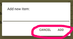 Ordering of AlertDialog's Cancel/Confirm buttons (circled in pink) 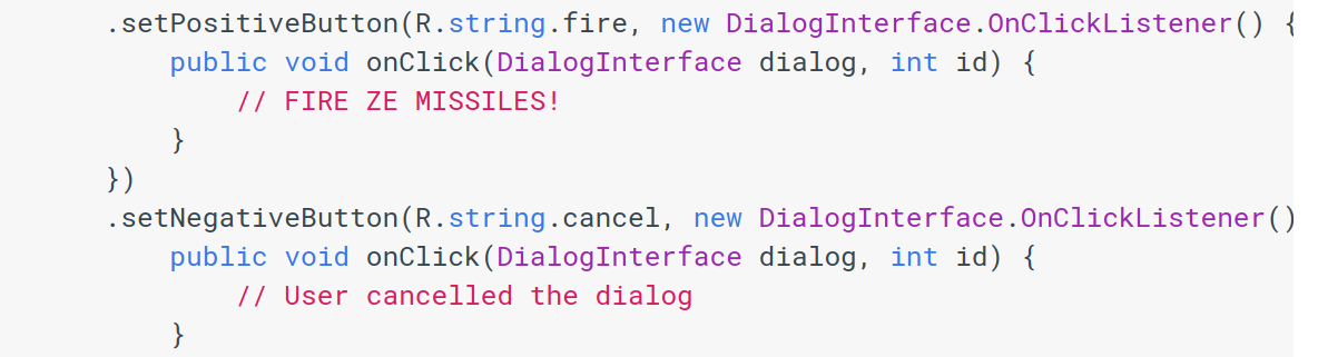 Android AlertDialog's setPositiveButton() & setNegativeButton() in code As indicated in the Issue Tracker link, this seems to be an intentional change for Android versions 4.0+. To be fair, I have noticed this similar ordering in operating system alerts (Linux Ubuntu, perhaps) as well, so I suppose it isn't too odd. Comments are closed.
|
AuthorExploring Android and mobile web design, security, and development. Archives
March 2021
Categories |
 RSS Feed
