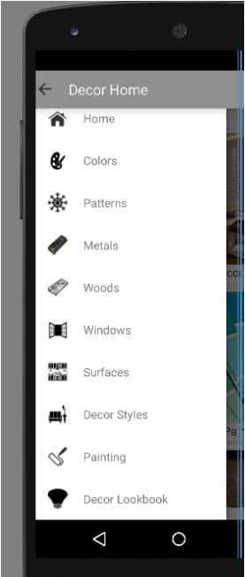
 Experimenting with the new support library for a future app update, I was able to convert a basic button layout to a more user-friendly navigation drawer. It will be a nice change as this app was created nearly three years ago and targeting older Android versions. The conversion from activities to fragments was also surprisingly easily. Converting the old button-based main layout to Lollipop's new Material design CardView allowed preservation of the old, more traditional navigation in conjunction with the new nav drawer. 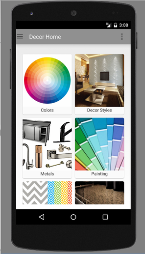 Would've liked more customization and will look into that, but suspect that it is intentionally this way to maintain the uniformity of Material design.
* Edit - Seems to be fixed now with version 24 update. Still awaiting the fix for the odd bug with PagerTabStrip's titles not showing on first load until after swiping in version 23. Apparently, reverting back to the previous version may fix the issue, but seems a little troublesome to do so. androidcentral - The 'Stagefright' exploit: What you need to know
techradar - Google has lost control of Android, Stagefright and HTC highlight a really big security problem PCWorld - Android devices will soon run Windows software thanks to CrossOver and Wine PCWorld - Android malware hammers phones with unwanted ads, Kemoge malware lifehacker - This Graphic Explains How Much Time and Money It Takes to Develop a Mobile App
As Android Studio has been declared the official Android IDE for some time now, it's time to transition over, albeit somewhat late. Not really wanting to uproot the development environment while in the middle of larger app updates, there was some delay.
In the meanwhile, dealing with the ever-outdated feeling of Eclipse ADT and the slow, glitchy behavior, I'm definitely welcoming a smoother development experience. No more twiddling the thumbs waiting for emulators to launch or excessive, consecutive Project-->Clean(s) to eliminate random non-legit errors. Haven't done a lot so far as still in the process of importing Eclipse projects over, but creating virtual devices using the AVD Manager has been amazingly fast and easy. 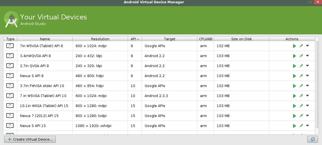
Overall, the environment just feels so fluid and polished -- definitely a nice change from the clunkiness of Eclipse ADT. Maybe there will be more time spent being productive versus wait times and random bugs. In an upcoming app update, I decided to transition from a ListView to a GridView for presenting months in a year. That way, there would be less scrolling to access the months and therefore, it should be easier to use and present a format more in line with the look of a calendar. 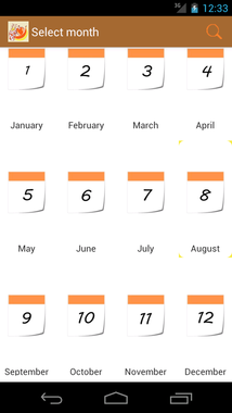 Perhaps somewhat spoiled by the ease of CSS styling, it was disconcerting how much research and tinkering it took to get the GridView centered on the screen. Initially, following the Android Gridview doc example functionality was fine, but appearance was another matter. Spending the majority of time trying to manipulate the GridView element itself, it was discovered that aligning the individual grid item achieved the desired effect.
month_gridview.xml <?xml version="1.0" encoding="utf-8"?> <LinearLayout xmlns:android="http://schemas.android.com/apk/res/android" android:layout_width="match_parent" android:layout_height="match_parent" android:background="#FFF" > <GridView android:id="@+id/gridview" android:layout_width="match_parent" android:layout_height="match_parent" android:numColumns="4" android:columnWidth="90dp" android:verticalSpacing="10dp" android:horizontalSpacing="10dp" android:stretchMode="columnWidth" android:gravity="center" android:listSelector="#F7EB42" android:layout_marginBottom="10dp" android:layout_marginTop="0dp" /> </LinearLayout> month_grid_item.xml <RelativeLayout xmlns:android="http://schemas.android.com/apk/res/android" xmlns:tools="http://schemas.android.com/tools" android:layout_width="match_parent" android:layout_height="match_parent" android:padding="5dp" android:background="@drawable/list_noborder" > <ImageView android:id="@+id/grid_image" android:layout_width="wrap_content" android:layout_height="wrap_content" android:layout_centerHorizontal="true" /> <TextView android:id="@+id/grid_text" android:layout_width="match_parent" android:layout_height="wrap_content" android:layout_marginTop="2dp" android:textSize="14sp" android:layout_below="@+id/grid_image" android:layout_centerHorizontal="true" android:layout_alignLeft="@id/grid_image" android:layout_alignRight="@id/grid_image" android:gravity="center" /> </RelativeLayout> Note the various layout elements required in the TextView to get the text below and center-aligned with its corresponding ImageView, another feat that took some experimentation to achieve.  With the new Android 5.0/Lollipop changes, the Actionbar's navigation modes seems to be deprecated, likely due to the new toolbar and related changes.
As seen in the image above, tabbed navigation could be created in prior versions in a rather straightforward manner using an instance of ActionBar and setting the navigation mode like so: ActionBar actionBar = getActionBar(); actionBar.setNavigationMode(ActionBar.NAVIGATION_MODE_TABS); // New tab Tab tabA = actionBar.newTab(); // Set tab's listener tabA.setTabListener(....); // Adding tab to actionbar actionBar.addTab(tabA); The use of ViewPager with FragmentPagerAdapter is a great alternative, though I did encounter the sort of glitchy behavior as described in this StackOverflow issue: Fragment is blank the second time it is viewed. Switching to FragmentStatePagerAdapter did correct the issue with multiple fragments not loading properly. Achieving rounded corners on Android views is relatively straightforward. Under res/drawable, an xml file can be used for creating this style to be applied to a view. rounded_corners.xml <?xml version="1.0" encoding="utf-8"?> <shape xmlns:android="http://schemas.android.com/apk/res/android" android:shape="rectangle"> <!-- View background color --> <solid android:color="#FFF" > </solid> <!-- View border color and width --> <stroke android:width="3dp" android:color="#FFF" > </stroke> <!-- If padding is desired --> <padding android:left="4dp" android:top="4dp" android:right="4dp" android:bottom="4dp" > </padding> <!-- Corner radius --> <corners android:radius="10dp" > </corners> </shape> After creating this xml file, it could be applied to a view to achieve rounded corners like so: <RelativeLayout ..... ..... > <LinearLayout android:layout_width="match_parent" android:id="@+id/home_layout" android:orientation="vertical" android:layout_height="wrap_content" android:background="@drawable/rounded_corners" android:layout_marginRight="15dp" android:layout_marginLeft="15dp" android:layout_marginTop="15dp" android:layout_marginBottom="15dp" > </RelativeLayout> The above code created this rounded expandable listview as seen in the screenshot below. The margins applied in android:layout_margin allowed a red border surrounding the listview as specified by its parent layout - the LinearLayout as seen above. The main view's (RelativeLayout) android:background supplied the rich red background facilitated by the 15dp margins on its child LinearLayout view.  After some investigation, rounded corners on Webviews doesn't seem possible, at least not with the same ease of effort as it can be for other views. To achieve the similar look to the listview, it would have to be accomplished in CSS. <style > body { font-size: 110%; padding: 2.5%; margin: 2.5%; background-color: #FFF; border-style: solid; border-width: 4px; border-color: #FFF; border-radius: 25px; } html { background-color: #D90B0B; } </style>  Unless otherwise specified, activities within an Android app will default to the icon specified in the application node of the manifest file.
Example: <application android:allowBackup="true" android:icon="@drawable/ic_launcher" android:label="@string/app_name" android:theme="@style/AppTheme" > When trying to use a different icon within each unique activity, I noticed specifying it under the application node's android:icon didn't seem to work as it also overrode the application/launcher icon. Apparently, for activity-specific manipulation, you would specify the icon under the android:logo (API level 10+) element instead. Example: <application ... ... > <activity android:name="com.yoursite.yourapps.MainActivity" android:label="@string/app_name"> <intent-filter android:logo="@drawable/customicon"> <action android:name="android.intent.action.MAIN" /> <category android:name="android.intent.category.LAUNCHER" /> </intent-filter> </activity> </application> Alternatively, the android:logo can be set in the <application> node to specify the launcher icon, while setting android:icon for custom Activity icons also works. Retrieving a string-array in xml file (res/values directory):
// Declare Resources object Resources res = null; // retrieve resources for project (usually in onCreate() or similar) res = getResources(); // assignment of strings into array String yourArray = res.getStringArray(R.array.yourArrayName); Retrieving single string (same requirements as above for Resources declaration and retrieval): String yourString = getString(R.string.yourStringName); Libraries for ActionBar (from Android Developers documentation)
Changing background color for ActionBar ( in onCreate() ): ActionBar actionBar = getActionBar(); ColorDrawable colorDrawable = new ColorDrawable (Color.parseColor("place desired hex number")); actionBar.setBackgroundDrawable(colorDrawable); Changing text color for ActionBar: actionBar.setTitle(Html.fromHtml("<font color=\"white\">" + getString(R.string.app_name)/desired text + "</font>")); 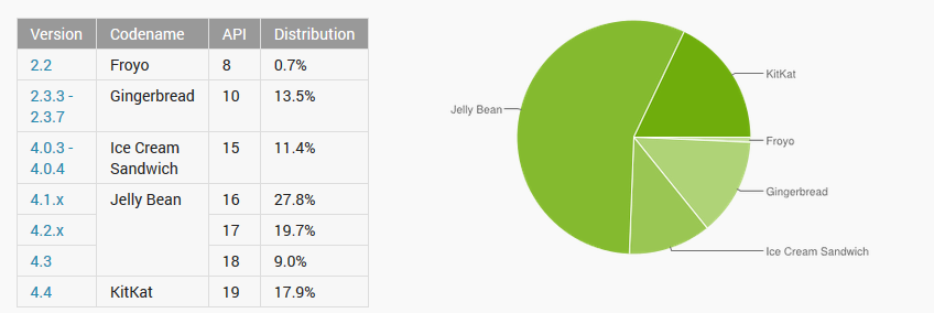 Android platforms - 07/2014 Android Froyo, version 2.2 seems to finally be phasing out among users. While the Gingerbread percentage is relatively sizable, this seems to be decreasing too.
Recently, when upgrading from the former AbMob to the new Google Mobile Ads SDK, support for 2.2 was dropped. For existing apps supporting down to 2.2, this posed an issue when AbMob ads were being served to the current app version. Rather than drop support altogether for users below 2.3.3 as revealed in user statistics, a different ad network was implemented solely for 2.2. This required multiple APK support which isn't exactly ideal, but avoids alienating those users who have yet to upgrade. Hopefully, those users will eventually drop in numbers significantly so that support can be dropped altogether. Notes on multiple APK support - Signed by same key for both versions and share like package names, each of the APKs must possess their own, unique version code as expressed in the manifest file as android:versionCode, and configuration requirements/supports must vary between the different APK files. Enabling multiple APK capabilities within the Developer dashboard requires switching from simple to advanced mode. |
AuthorExploring Android and mobile web design, security, and development. Archives
March 2021
Categories |
 RSS Feed
